Mary Voorhees Meehan
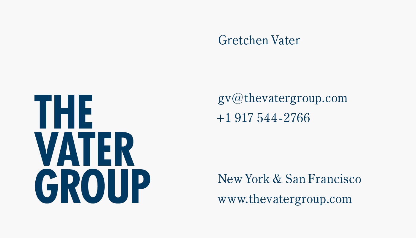
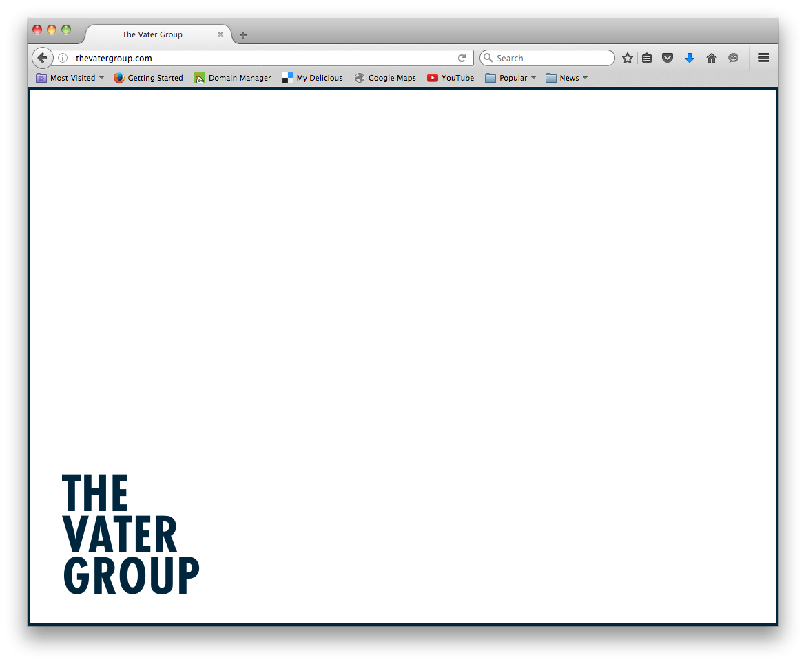
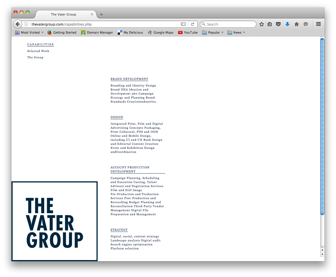
The Vater Group
Correspondence card
Business card
At the outset, there's always a problem. With this company, much of the work is from prior agencies and/or is difficult to show due to timed release. We focused on developing a typographic attitude that is leading. Specifically, proprietors asked me to create a look that suggested timelessness and solidarity. The identity, a framed word mark, behaves as a frame or a stamp depending on the context. For an agency charged with creating and maintaing a point of view, gestures which suggest both seeing and claiming seem apt.
-
 announcements
- Apparel
- architectural
-
 Art Direction
- artistic
-
 Books
Books
- ceremonial instr.
- Choices
- collections
- Elementary
- events
- Evidence
- Fashion
- Feedback
- fun
- Games
- Hospitality
-
 Identities
- Illustration
- interactive
- Invitations
- Kinships
- Lifestyles
- luck
- Mark
- parties
- Pedagogy
- politics
-
 Posters
- prop styling
- Purple
- Reenactments
- Religious
- School
- spaceships
- Sports
- Tourism
- typography
- videos
-
 websites
- Workshop