Mary Voorhees Meehan
BINGO
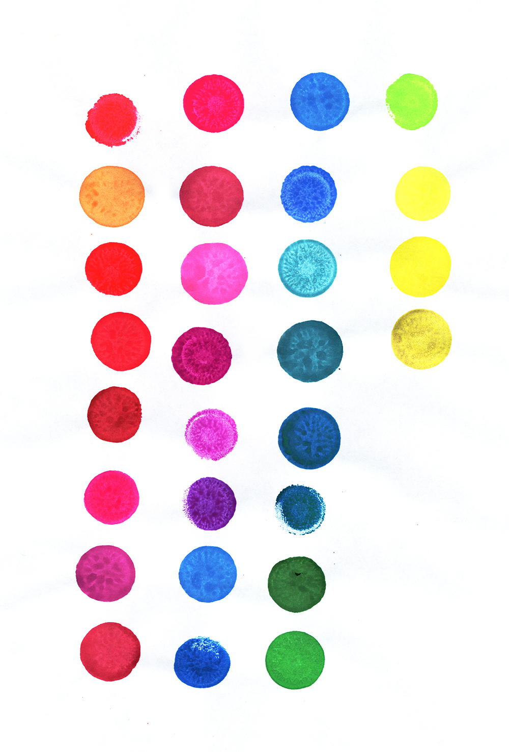
Column 1—
Sunsational Coral
Dab O’ Ink Orange
Sunsational Red
Sunsational Ruby Red
Dab O’ Ink
Dab O’ Ink Christmas Purple
Dab O’ Ink hot pink cap*
Sunsational Pink
Column 2—
Dab O’ Ink mauve cap
Dab O’ Ink Pink
Sunsational Purple*
Sunsational Lilac
Sunsational Violet*
Christmas Blue
Dab O’ Ink Blue
Column 3—
Sweet Spot Blue
Dab O’ Ink, no wrapper
Sunsational Aqua*
Dab O’ Ink Aqua
Sunsational Teal*
Sweet Spot, no wrapper
Dab O’ Ink
Sunsational Green*
Column 4—
Sunsational Lime Green*
Sweet Spot Yellow
Dab O’ Ink Yellow
Sunsational Gold :(
* Really hot right now
:( Discontinuedd
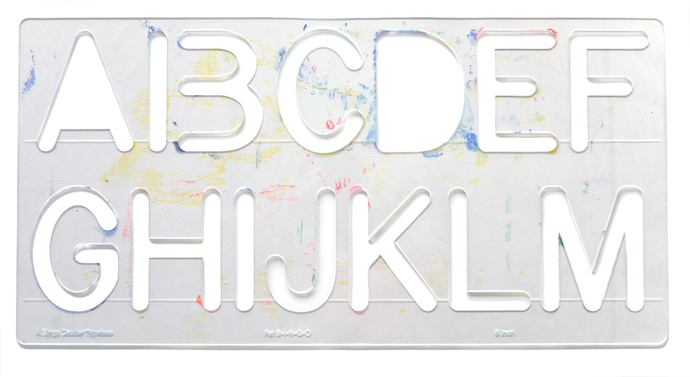
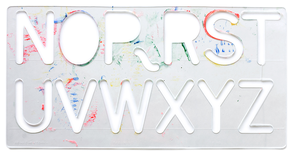
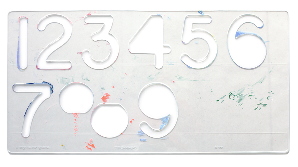
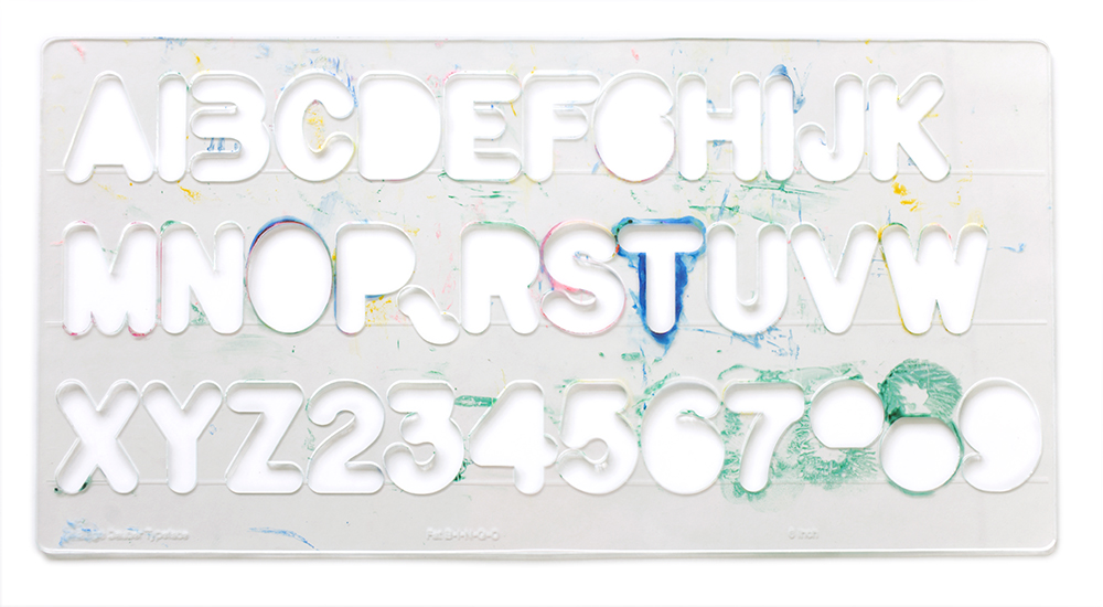
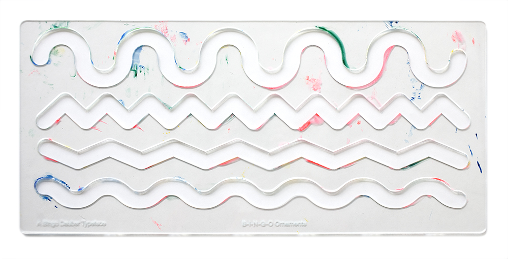
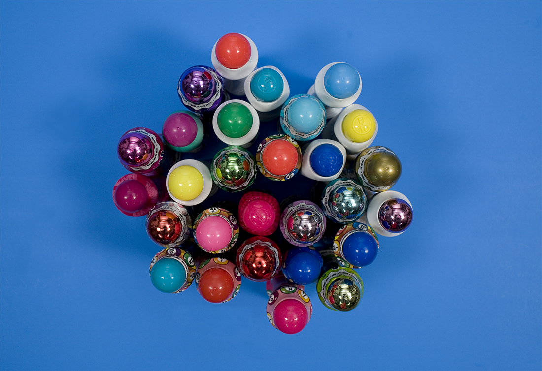
I secured one of every color of BINGO dauber in existence, drew a mono-line typeface to fit the width of the dauber head, and cut a series of five stencils. The stroke of the letter is always the width of the dauber, so that as the typeface gets smaller, it gets bolder.
When I showed these stencils to Matthew [Carter], he encouraged me to use them to procure more and varied results. He has a surprising penchant for the messy and the unexpected and the happenstance. He liked my stencil. Rather than pursue another typeface to this end, perhaps one that answered my disappointments with the first, he was a lot more interested in me just using this one more and more with all different shapes of writing implements.
He was interested in what I was saying about tools that were never meant to be used for writing. But, he was most excited about the odd shapes and textures that might be yielded by a series of different instruments and substrates, and I in the way the ensuing letterforms would describe the BINGO dauber. I was thinking they could be portraits or descriptions of the BINGO dauber told in the languages of shampoo pumps and chocolate kisses.
-
 announcements
- Apparel
- architectural
-
 Art Direction
- artistic
-
 Books
Books
- ceremonial instr.
- Choices
- collections
- Elementary
- events
- Evidence
- Fashion
- Feedback
- fun
- Games
- Hospitality
-
 Identities
- Illustration
- interactive
- Invitations
- Kinships
- Lifestyles
- luck
- Mark
- parties
- Pedagogy
- politics
-
 Posters
- prop styling
- Purple
- Reenactments
- Religious
- School
- spaceships
- Sports
- Tourism
- typography
- videos
-
 websites
- Workshop